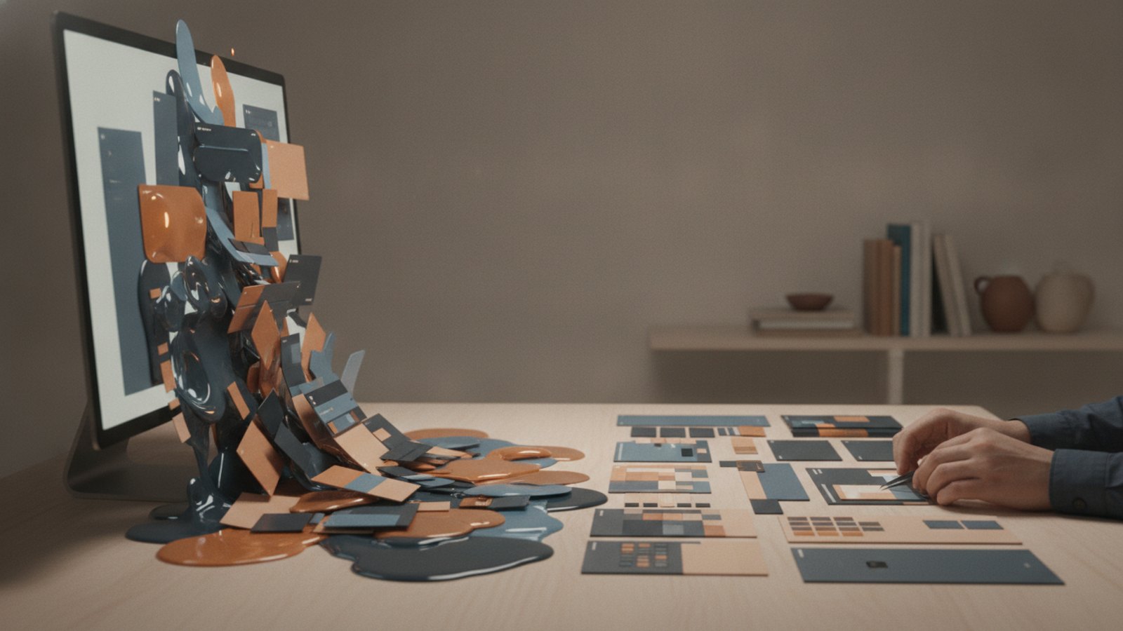
If you’re using AI to make graphics, social posts, or brand visuals and they keep coming out looking generic, weird, or just a little off, you’re not alone. The problem usually isn’t the tool. It’s the workflow.
Okay, so here’s the good news: you do not need to become a full-time designer to create better visuals. But you do need better taste, better process, and a human in the loop. That’s what makes the difference between useful AI and obvious AI slop.

TL;DR
- AI is a design tool, not a replacement for design judgment.
- The fastest way to make bad visuals is to ask one tool to do everything.
- Strong AI visuals start with a clear creative direction, not a clever prompt.
- If you can’t describe what you want, AI will fill in the blanks with average-looking results.
- Branding should usually be applied and refined by a human in tools like Canva or Photoshop.
- Prompt writing gets better when you first define style, mood, layout, and purpose in plain English.
- Knowing how to use an AI image tool is not the same as knowing how to design.
- The best workflow is hybrid: AI for ideas and drafts, human judgment for refinement and brand consistency.
What makes an image look obviously AI-generated?
An image looks “AI-made” when it feels polished but wrong. The composition may be dramatic, but the brand fit is weak. The colors may be flashy, but the message is muddy.
In practical terms, the usual tells are:
- inconsistent branding
- too many visual details
- strange text handling
- overly glossy lighting
- generic facial expressions or poses
- style that doesn’t match the business
- visuals that attract attention but don’t communicate anything clearly
That’s the real issue. A lot of AI-generated images aren’t bad because they were made with AI. They’re bad because nobody made actual design decisions.
AI should strengthen the creative process, not replace it
The best way to use AI in design is as a partner in the early and middle stages of the process. It can help you generate concepts, directions, rough drafts, and variations fast.
But if you expect it to handle concepting, layout, branding, typography, polish, and final production all by itself, things start to drift.
I like this rule: use AI for speed, but use humans for standards.
That’s especially true for small businesses. You want to do more with less, right? Great. AI can absolutely help you do that. But saving time only matters if the end result still looks like your business and builds trust.
Don’t ask one tool to do everything
This is one of the biggest mistakes people make. They open one AI tool and expect it to handle the whole job from idea to final branded asset.
That sounds efficient. It usually isn’t.
In one example, when branding needed to be added to generated visuals, even the tool itself suggested doing that part manually in Canva or Photoshop because otherwise elements could shift over time and things might get messed up. Honestly, that’s a pretty self-aware machine.
Here’s the decision rule:
- Use AI tools to explore concepts, compositions, and visual directions.
- Use design tools to finalize branding, placement, typography, and consistency.
- Use your own judgment to decide whether the image actually communicates the right message.
If you only do one thing differently, do this. Stop treating AI like an all-in-one art department.
How do you create better AI visuals? Use this 5-step workflow
The way that it works is pretty simple. You separate ideation from refinement.
Step 1: Start with the communication goal
Before you write a prompt, decide what the visual needs to do.
Ask:
- Is this supposed to stop the scroll?
- Explain an idea?
- Support a newsletter or blog post?
- Fit a brand campaign?
- Help convert someone at the bottom of the funnel?
A visual for awareness looks different from a visual for conversion. If you skip this step, you get pretty images that don’t help you.
Example: A SaaS founder creating a LinkedIn graphic might need clarity and authority. A children’s brand might need warmth and playfulness. Same tool, very different outcome.
Step 2: Translate your vision into words
This is where most people realize the real bottleneck isn’t AI. It’s articulation.
A lot of us have never had to describe our visual ideas in detail. We just sort of knew what we wanted when we saw it. AI doesn’t work like that. It needs direction.
One designer put it really well:
“I’d never actually tried to verbalize what my ideas were. I need to figure out how to say what I’m thinking so that the AI understands me.”
That’s the game. Better prompts usually come from better thinking, not fancier wording.
Try describing:
- the subject
- the mood
- the color palette
- the composition
- the brand personality
- what to avoid
- where it will be used
Bad prompt: Create a modern business image.
Better prompt: Create a clean editorial-style illustration for a small business marketing newsletter. Use muted blues and warm neutrals, minimal background detail, subtle texture, and a confident but approachable tone. Avoid glossy 3D effects and overly futuristic elements.
See the difference? One gives the AI almost nothing. The other gives it a lane.
Step 3: Use AI to help you write the prompt
If you don’t know how to describe what you want, ask AI to help you build the prompt first.
That’s a really underrated move.
A smart approach is to say something like:
“I want to create something like this. Can you help me write the prompt?”
You can also ask for multiple visual directions before generating anything. For example:
- give me 5 creative directions for this brand
- suggest 3 illustration styles for this topic
- help me choose a visual concept for a newsletter header
- what prompt would create a more editorial, less generic result?
This works well because you’re using AI as a creative translator, not just a vending machine.
And when you have no idea where to start, simple prompts can still be useful for brainstorming:
“I’ll just put in a really simple prompt, and then it spits out some ideas, and then I can start to work with it from there.”
That’s how AI should help you: by giving you momentum.
Step 4: Generate rough options, not final assets
Treat the first rounds as drafts.
Your goal is to get:
- concepts
- angles
- compositions
- mood directions
- visual metaphors
Your goal is not to get the perfect final image on the first try. That mindset is what leads to disappointment and weird-looking results.
Review outputs and ask:
- Does this fit the brand?
- Is the message instantly clear?
- Does it feel original enough?
- What needs to be simplified?
- What feels too “AI shiny”?
Then iterate.
Step 5: Finish the design manually
This is where the real professionalism shows up.
Use your design tool of choice to handle:
- logo placement
- brand colors
- text overlays
- spacing
- cropping
- alignment
- template consistency
This final polish is what keeps visuals from drifting into that “close enough” zone. And close enough is where trust starts leaking.
For small businesses, this matters a lot. People make snap judgments. If your graphic looks lazy, they assume the business might be too.
Don’t confuse design with design tools
This is probably the most important point in the whole conversation.
Knowing how to use a tool is not the same thing as knowing how to design.
As one designer said:
“You know how to use that tool … but knowing how to design is a completely different skill set.”
That distinction matters because tool access is now basically universal. Taste is not. Judgment is not. Visual hierarchy is not. Brand consistency is not.
Design skill includes things like:
- choosing what to emphasize
- removing clutter
- creating contrast
- using whitespace well
- matching style to audience
- communicating clearly at a glance
AI can assist with outputs. It cannot automatically supply discernment.
Common mistakes that make AI visuals look cheap
Most bad AI visuals come from the same few habits.
Using prompts that are too vague
If you say “make it professional,” the tool will guess. Usually badly.
Letting the tool decide your brand style
If your brand has a voice, a palette, and a point of view, don’t hand that over randomly.
Keeping everything the AI generated
You should edit. Always.
Prioritizing novelty over clarity
Just because something looks wild doesn’t mean it works.
Using AI-generated logos as final brand assets
Logos need precision, consistency, and intentionality. They are not a place to wing it.
Skipping human review
You definitely need the human in the loop. No question.
A practical checklist for visuals that feel polished, not automated
Before you publish an AI-assisted visual, run through this list:
- Does it match my brand colors and tone?
- Is the message clear in under 3 seconds?
- Does the composition look intentional?
- Is there anything visually strange, distorted, or overly dramatic?
- Would I still use this if nobody knew AI helped create it?
- Does it look like my business, or just like the tool?
- Have I refined the final asset manually?
If the answer to several of those is no, don’t post it yet.
FAQ
Can AI create professional-looking brand visuals?
Yes, but usually not by itself. AI can help generate concepts and strong starting points, but human refinement is what makes visuals feel on-brand and trustworthy.
Why do AI images often look generic?
Because the prompts are vague, the style direction is weak, or the user is relying on the tool to make design decisions. AI defaults to averages when you don’t provide enough specificity.
Should I use one AI tool for the entire design process?
Usually no. Use different tools for different jobs. AI for ideation and image generation, then Canva, Photoshop, or another design platform for final editing and branding.
How can I write better AI image prompts?
Start by describing the purpose, audience, style, color palette, composition, and what to avoid. If that feels hard, ask AI to help you build the prompt before generating the image.
Do I need to be a designer to use AI image tools well?
Not formally, no. But you do need some design judgment. At minimum, you need to understand clarity, hierarchy, consistency, and brand fit.
Are AI-generated logos a good idea?
They can be useful for concept exploration, but they’re usually a weak choice as final logo assets. Logos need deliberate refinement and long-term consistency.
What should I do if my visuals still feel “too AI”?
Simplify them. Reduce effects, tighten branding, improve composition, and edit manually. Most “too AI” visuals are overdone, not underdone.
Next steps
If you want better visuals without hiring a full design team, here’s where I’d start:
- Pick one recurring content format, like newsletter headers or social graphics.
- Define your brand style in plain English.
- Build 3 to 5 prompt templates around that style.
- Generate rough concepts with AI.
- Finish every final asset manually in a design tool.
- Save the best-performing designs as references for future prompts.
That process helps you get faster over time without sacrificing quality.
Final thoughts
AI makes visual creation easier. It does not make design optional.
That’s the part people miss.
The businesses getting the best results are not the ones blindly generating more images. They’re the ones using AI to accelerate thinking, explore ideas, and reduce production time while still applying human judgment at the end.
Right? That’s the sweet spot.
Use AI to help you move faster. Use design principles to make sure you’re moving in the right direction.
Leave a Reply